


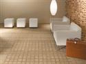
By the dawn of the next decade, “we’ll be bored and ready for dramatic change,” Gosline predicts. The warm metals keep trying to break in again but their time has not come. Likewise, blue is also on the horizon and is just beginning to show. “We aren’t looking for fads or flash. We need substance and light. We need to experience the joy of comfortable spaces designed for real people. Tomorrow, we’ll deal with change.”
COLOR IN RESIDENTIAL DESIGN “Most designers consider the floor as the ideal location to begin their interior projects because it’s the largest expanse of space within an interior,” says Emily Morrow, director of color, style and design for Shaw Industries.
She says there are some subtle changes on the color horizon. Neutrals are still popular but consumers are looking for more color and more vibrance. Although today’s palettes have become darker, richer and more complex, white is emerging and has a fresh appeal, reflecting cultural sign posts like the iPod’s ever-present white ear buds and casings.
Morrow notes that there’s also a resurgence of the 1980s, which has crept into fashion, music, and home. Many of these trends will be only vaguely familiar to consumers who lived through the 80s, and the color combinations will make many looks new again. They’ll also appeal to younger consumers who didn’t experience the decade of “over the top opulence and preppy style,” and to mature consumers who have fond memories of that luxurious decade.
All things that exemplify over the top glamour and luxury, such as exotic locations like Dubai, are in every area of design in color, texture, and pattern, on the runway and in the home.
Glamour and luxury lead many residential consumers to turn to carpet and rugs for their design inspiration, Morrow says. They’re attracted by the use of rich color, accents of black, chocolate, lustrous yarns, and intricate patterns that include florals, vines, grids, checks, harlequin diamonds and even zebra or crocodile.
Also, hand-scraped, chiseled-edged, distressed wood floors are crossing all style boundaries. What initially was seen as rustic is now being installed in urban lofts, formal traditional homes, traditionally modern interiors and more. “Designers and consumers are drawn to the crafted element, especially the subtle chatter marks left there by a true craftsman,” Morrow says. “These components are always impacting the color palettes of carpet and rug styles.”
On specific color trends, Morrow says, “We’re seeing variations of rich shades of green in the classics such as emerald, kelly, and milky-green sea glass greens. Blue-based greens still appeal and are bridging well with new color introductions such as gray and the dark chocolates as well as classic black. Yellow-based greens are staying strong because of their link to environmental awareness as much as for their pop. Versatile, almost-neutral gray-greens can be subtle and sophisticated.”
Navy, true blue, and the diluted water blues are also important. Nautical, blue-and-white, bold stripes are very strong. Soft shades of aqua, reminiscent of the “water” colors that have been trending strongly for the past two or three years are still vital. Morrow predicts that blues will become more diverse, influencing purples and green. Also, blue-greens will be seen in unusual combinations with other colors such as rich browns, yellow-greens, and vivid red-oranges.
Seville red is being used as a contrast against satiny, lacquered surfaces. “Red is always classic and dramatic—the significant aspect of red is whether it’s influenced by blue or yellow,” Morrow says. “Today’s Chinese red is definitely a rich red-orange, but look out for Seville red, which is a purer red bordering on the blue side. Bright corals are strong, while mid-value pinks will begin to decline in the next year.”
Pinks have evolved toward rose, moving away from the pink that flooded the marketplace over the past four years. She notes that the Evelyn Lauder Breast Cancer Awareness Pink Ribbon campaign created a tidal wave of home and fashion products in the pink family. “We’ve definitely grown up from the little-girl pink into mature and confident rose and raspberry pinks,” Morrow says.
Metallic Color Trends Copper has been appearing in eye-catching automotive color as well as in kitchen appliance fronts and more, and has worked its way into upholstery and drapery fabric, paint and fashion. Some of the coppers and muddy oranges are burnished and appear oxidized. Orange is still on the scene in both muddier and brighter contexts. Specialty finishes can create a rich oxidized patina or the appearance of molten lava.
Subtle yellow-golds are appearing in gilded finishes, burnished leather, or precious metals. “It’s been at least 12 years since consumers were ripping out their polished brass fixtures in the home, had diamonds reset in platinum bands, and switched over to brushed nickel, pewter and the like, Morrow says. “Now that stainless steel appliances are in mainstream American homes, our hearts long for something that is not seen everywhere. Gold today is still not the highly polished gold of the 80s but is bronzed over, burnished and patinaed.” Gold is in everything from handbags to chain-mail couture to beading.
Rich Neutrals Brown has become increasingly respected and dominant and is recognized as an alternate classic, like black. We’ve seen all shades of brown, including mocha, cinnamon, chocolate, and coffee. Dark
and medium chocolates, ranging from coffee bean to latte, and lustrous or mineralized shades of just-tilled earth, can be paired with vibrant, unexpected colors. It’s warm and elegant when used with aged gold, or dramatic and daring with magenta or orange. “Brown maintains its appeal because it complements a multitude of tastes and lifestyles,” Morrow says.
Golden beige and taupe are easy to live with and to use as a neutralizer among the vibrant coppers, reds and yellows. “For the ultimate combination of sophistication, pair gray with taupe, tan or brown.”
Neutrals are becoming darker and more saturated and are now being infused with a blush of color—sometimes relating to golden skin tones—creating the effect of more personalized options for consumers. Neutrals in all constructions are becoming darker, such as taupes, tobaccos and anything reminiscent of leather.
Gray is also making a strong comeback. Gray flannel and charcoal are re-emerging, possibly because of the sleek contemporary look that is stylish in home furnishings. Brushed nickel and aged pewter are popular for appliances and hardware. Grays are clean and straightforward, with no influence from blue or green.”
Black is being used as an accent in every room in rugs, carpet, fabric, and accessories. Black and white combinations are popular in large-scale, traditional motifs. Black accents in textiles of all kinds are in demand, giving added body and visual dimension.


Join Our Newsletter
Get the latest flooring industry news delivered weekly.